Case Study 3
Creativebug Sign Up Page
I redesigned the Creativebug subscription sign-up page to better clarify the subscription benefit proposition, and to improve subscription conversion.
Problem and Opportunity
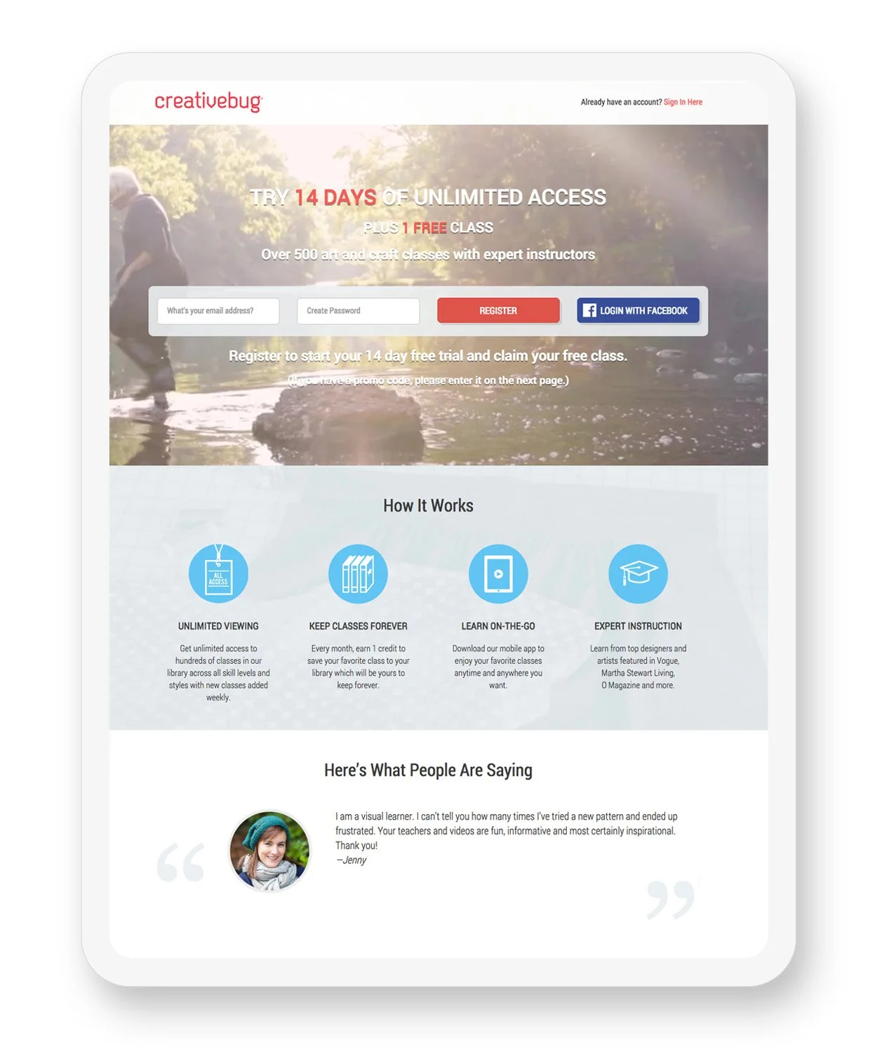
The existing sign-up page was not performing well enough. User feedback and consensus among the Creativebug team confirmed that the existing design was visually confusing, and that the subscription benefit proposition was unclear. We knew that the design needed to be simpler so that there was no opportunity for users to hesitate.
Before
Role and Process
As the designer for the website and art director for its photography, I wanted to ensure brand consistency while providing a clear and easy path for subscribing to the platform. I utilized some of our existing beautiful photography and made the subscription benefits text front and center.
● Collaborated with our marketing and development teams to understand the goal for the project and to ensure that I was creating the best solution for customer needs as well as business objectives.
● Created high fidelity designs that upheld the brand aesthetic while also being quick and easy to read and subscribe to the platform.
● After presenting multiple design options and making updates, finalized files, conducted hand-off meeting, and worked with our developer to make final revisions before launch.
Solution
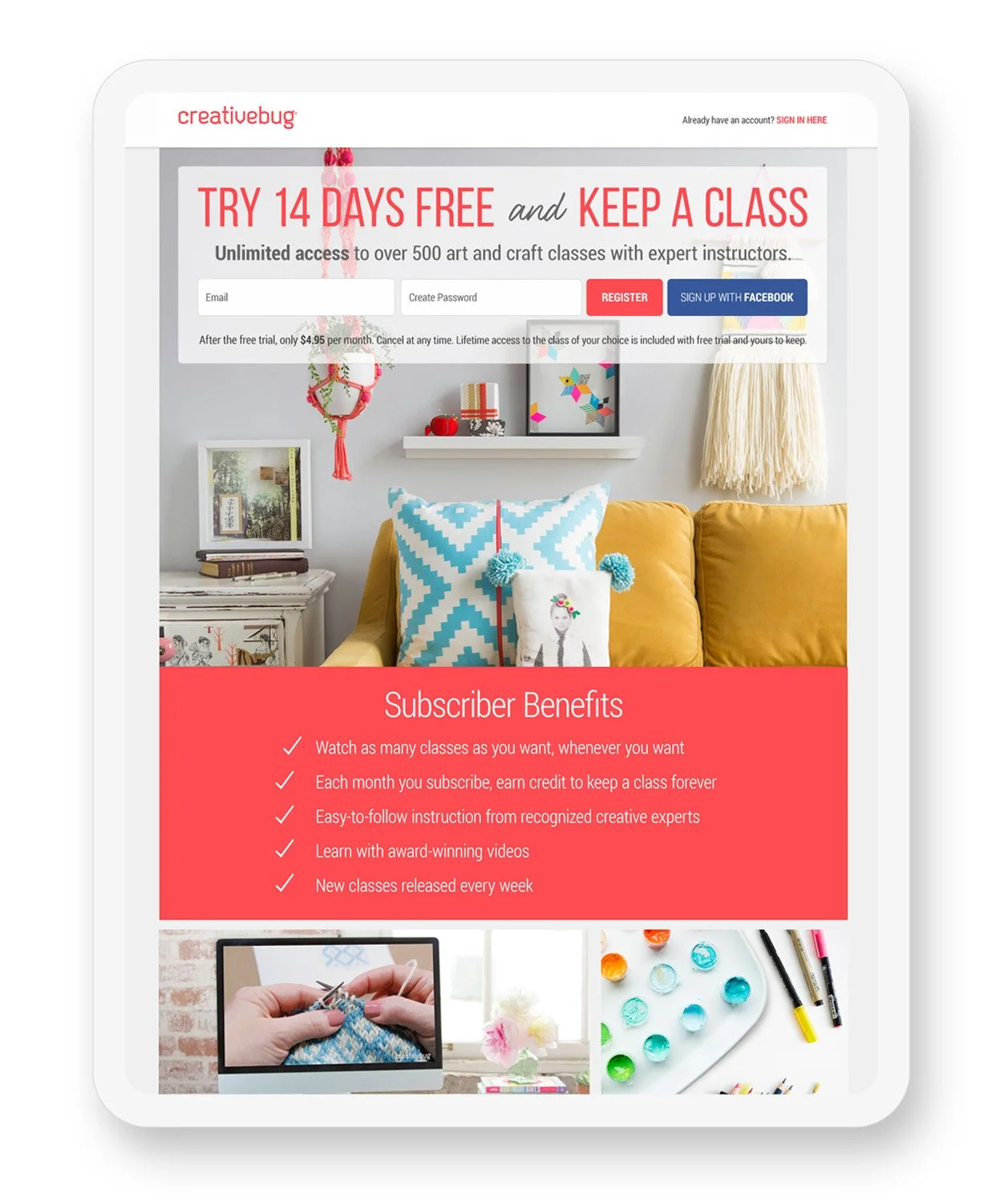
After
I created a sign-up page that would be visually arresting, to appeal to our creative users. The new design was easy to navigate and read at a glance, and made it easy to create an account and immediately dive into a class.
Outcome
New visitor bounce rates decreased, and subscription conversions increased, fairly immediately after this new design was launched. The redesign successfully accomplished its business objective of increasing new user subscription purchases.